Designing layouts and cards
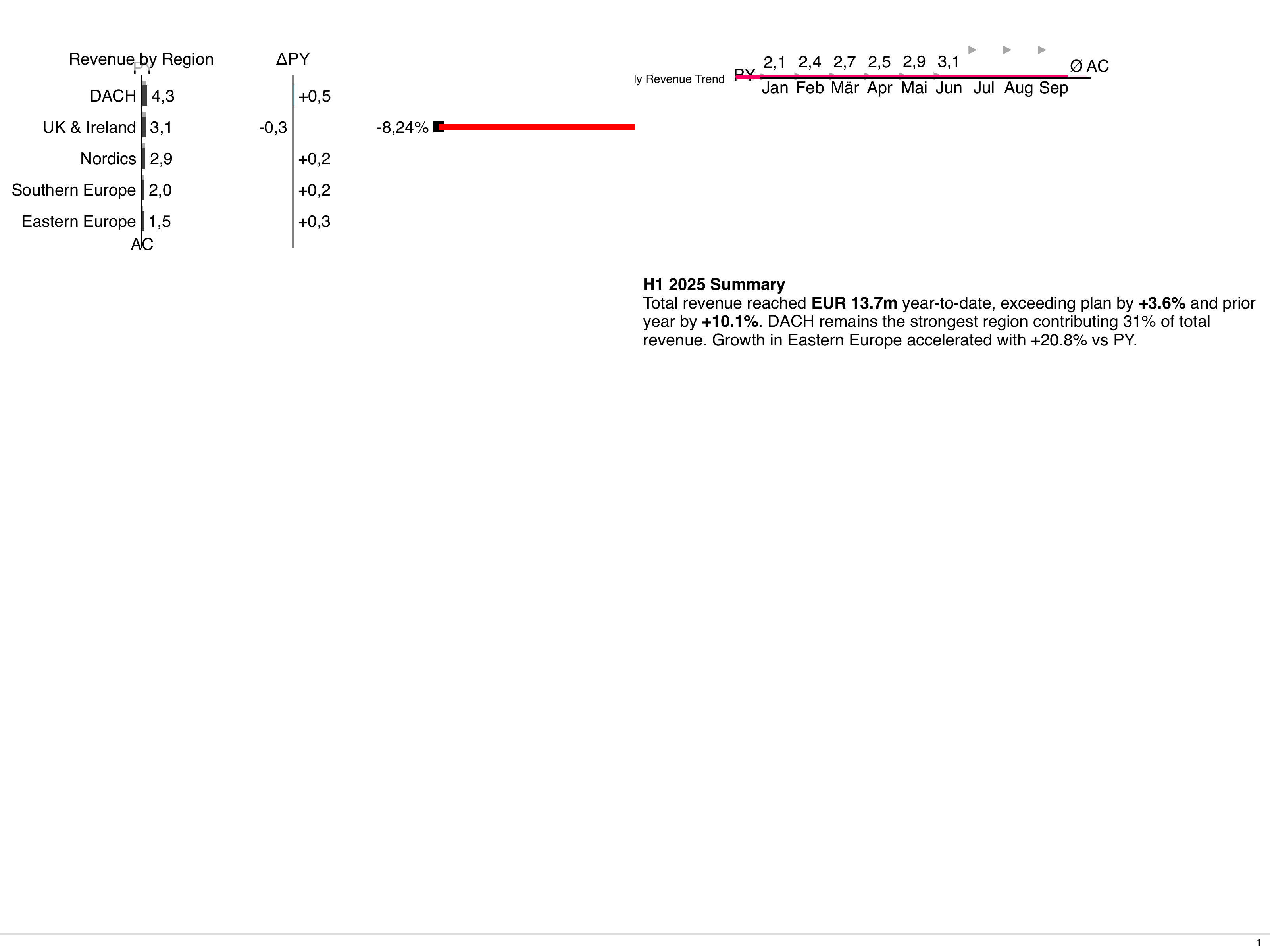
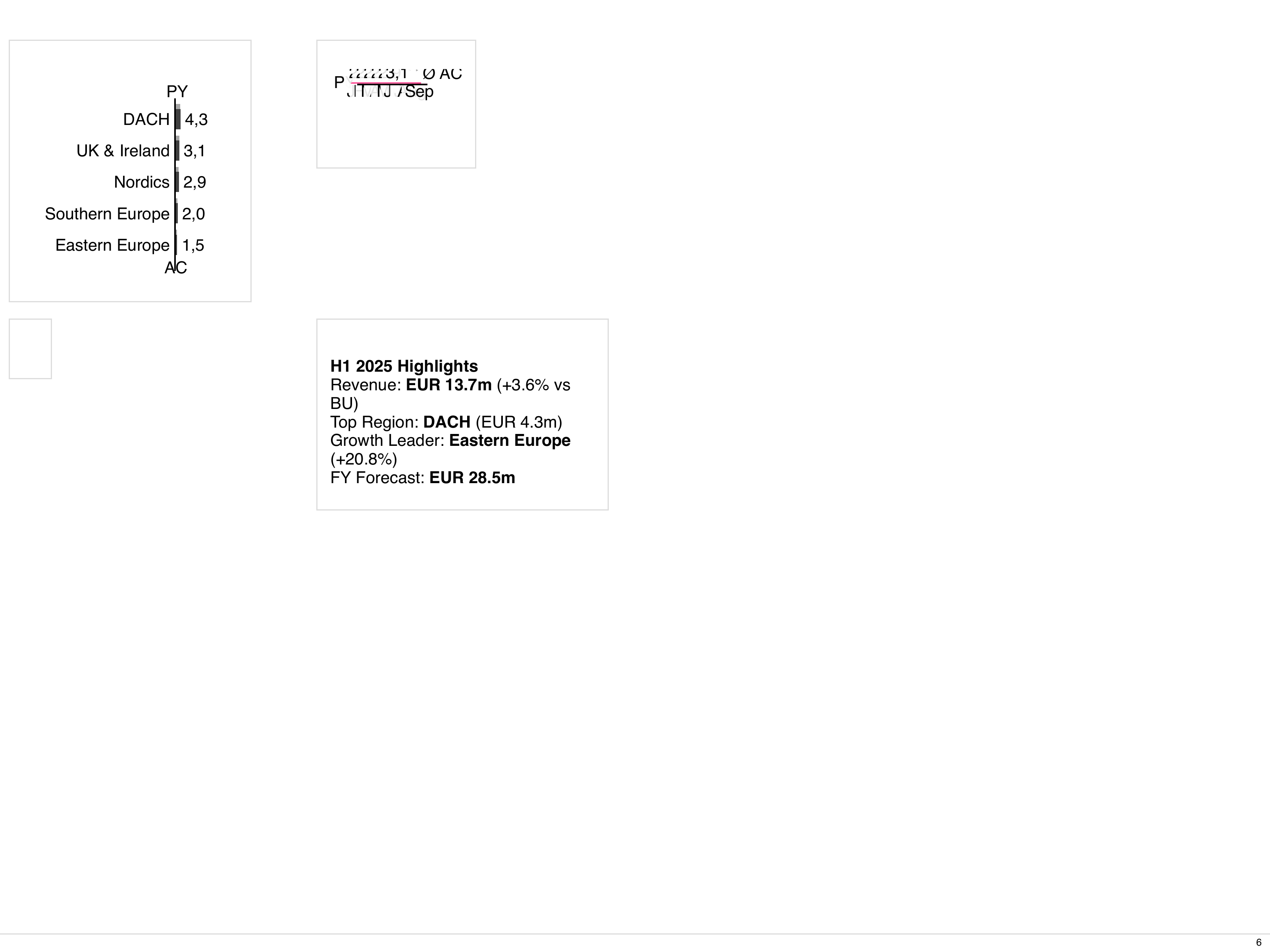
This guide shows how to combine LayoutPage and LayoutCard to build dashboards.
You will define a page-level layout with nested cards and components.
1. Choose a page layout
Section titled “1. Choose a page layout”Start with LayoutPage and a grid layout:
---
apiVersion: bino.bi/v1alpha1
kind: LayoutPage
metadata:
  name: dashboard_page
spec:
  titleBusinessUnit: "Group Controlling"
  pageLayout: 2x2
  pageFormat: a4
  pageOrientation: landscape
  footerDisplayPageNumber: true
  footerText: "Internal dashboard"
  children: []
2. Add KPI cards
Section titled “2. Add KPI cards”spec:
# ...
children:
- kind: LayoutCard
spec:
titleBusinessUnit: "Sales"
titleMeasures:
- name: "Revenue"
unit: "mEUR"
cardLayout: full
children:
- kind: ChartTime
spec:
dataset: revenue_monthly
chartTitle: "Monthly revenue"
type: line
dateInterval: month
axisLabelsMode: smart
- kind: LayoutCard
spec:
titleBusinessUnit: "Sales"
titleMeasures:
- name: "EBIT"
unit: "mEUR"
cardLayout: split-horizontal
children:
- kind: ChartStructure
spec:
dataset: ebit_by_region
chartTitle: "EBIT by region"
level: category
- kind: Table
spec:
dataset: ebit_by_region
tableTitle: "EBIT by region"
3. Use custom templates for complex layouts
Section titled “3. Use custom templates for complex layouts”For custom grids, switch to cardLayout: custom-template or pageLayout: custom-template:
cardLayout: custom-template
cardCustomTemplate: |
  "a a" \
  "b c"
children:
  - kind: ChartStructure
    spec:
      # placed in area a
  - kind: Table
    spec:
      # placed in area b
  - kind: Text
    spec:
      # placed in area c
Map child components to grid areas according to your front-end conventions.